Text and content are the most important parts of the artwork and should not be compromised.
For optimum legibility in production, we strongly recommend following our graphics guidelines.
For copyright reasons we are not allowed to use copies of your font sets. All text elements must be converted to paths!
Sizing and spacing
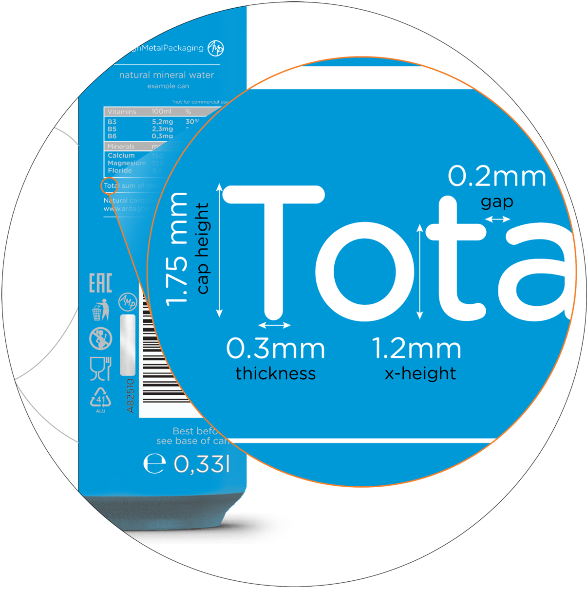
Negative Text
Lighter text on darker background: slightly taller cap height, thicker text.
Capital letter height
Letter thickness
X-height
Character gap
1.75mm
0.3mm
1.2mm
0.2mm
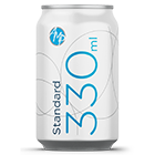
Positive Text
Darker text on a lighter background: slightly shorter cap height, thinner text.
Capital letter height
Letter thickness
X-height
Character gap
1.6mm
0.15mm
1.2mm
0.2mm
Please avoid using any serif or scripted fonts.
For copyright reasons we are not allowed to use copies of your font sets. All text elements must be converted to paths!