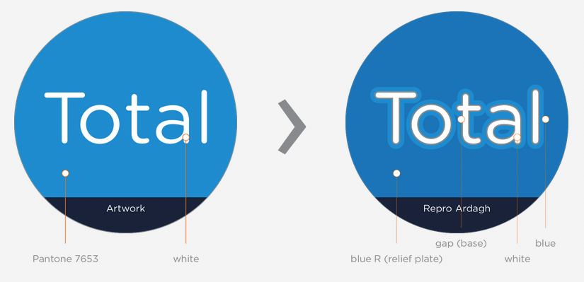
We need to compensate for dot gain, which occurs in the majority of all printing methods, in the reproduction of artwork. Positive elements tend to grow. Negative Elements tend to fill in. In a combination of a positive text printing into a negative background, we need to consider both, growth of positive elements and filling in of negative elements.
A separation gap will be applied between colours depending on the individual requirements during reproduction.
Separation gaps should not be applied to artwork files to avoid being mistaken as a printed outline.
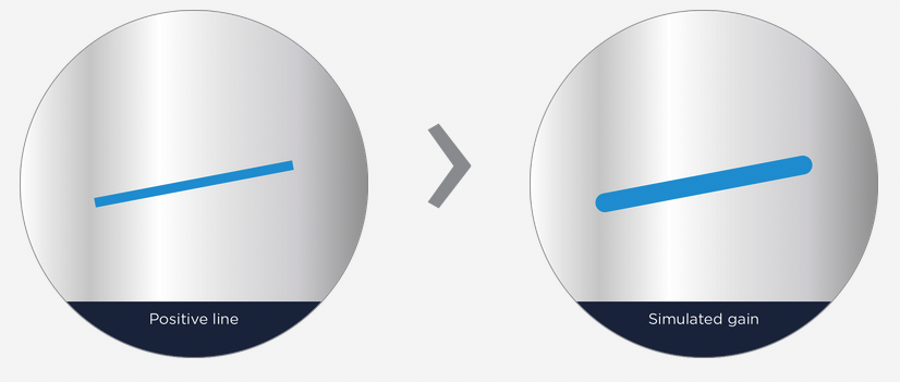
Positive line:
Individual lines – minimum 0.2mm
Lines grouped together – minimum 0.1mm
In the printing direction (horizontal) – minimum 0.25mm
Lines grouped together – minimum 0.1mm
In the printing direction (horizontal) – minimum 0.25mm
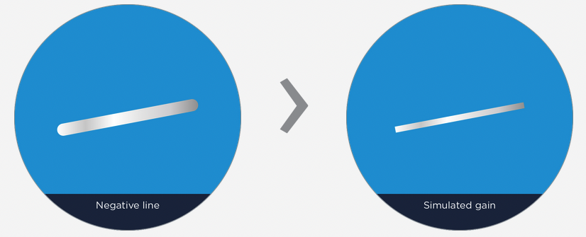
Negative line:
Lines grouped together – minimum 0.25mm
Opposite of the printing direction – minimum 0.35mm
Opposite of the printing direction – minimum 0.35mm